Thursday, February 25, 2010
4Q 2009 Distributive Trade Report
The report covers an overall assessment, and a breakdown by sector into wholesale, retail and motor vehicles. While quarter on quarter retails sales rose 0.6%, wholesale trade fell 0.8% and while motor vehicle sales fell 1.6%. In total sales fell 0.4% or -1.6% annualised. The retail sales segment looks good, but growth mainly came from department stores and supermarkets – discounts and pricing power I suspect.
No wonder nobody feels particularly enthused by “recovery”.
Technical Notes:
Distributive Trade 4Q2009 Report by the Department of Statistics
January 2010 CPI
Along with the 4Q2009 GDP report, we had two other stat releases yesterday: Jan 2010 CPI and BNM’s Jan MSB. I’ll cover the latter after updating my databases.
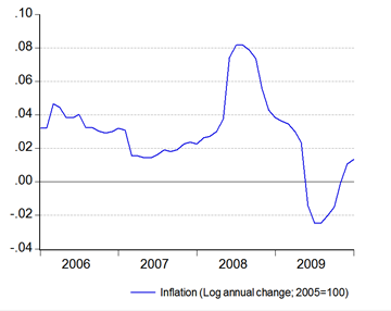
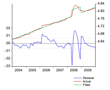
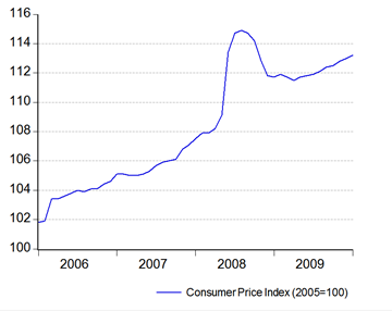
For inflation, inflation has largely returned to its long term trend (index numbers; 2005=100):
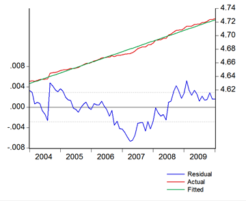
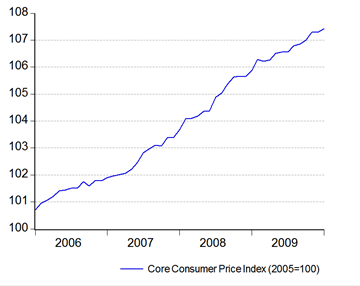
 You can get a stronger indication from the core inflation series (ex-food, ex-transport; 2005=100):
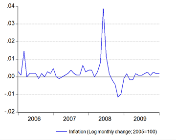
 The growth numbers look pretty benign, apart from the unsightly hump created by the rise in the market price for petrol in June 2008 (log annual and monthly changes; 2005=100):
 Given the fairly steady rise in the CPI, I thought it might be interesting to see what the long term trend is like. Using a dummy to take out the inflation effects of the 2008 fuel price hikes (value=0 for 2008:5 to 2008:12), and a sample range from 2004:1 to 2010:1 (there appears to be a structural break between 2003 and 2004), I got 0.235% for the CPI and 0.130% for the Core measure. That roughly translates to an average of 2.86% and 1.57% per annum:
Right now, both the CPI and Core measures are generally running below those averages, indicating continued slack in the economy (no surprise). But this is a useful benchmark to figure out whether inflation is under control or getting out of hand – or changing path entirely.
Technical Notes:
Consumer Price Index Report from the Department of Statistics
Wednesday, February 24, 2010
A Tale of Two (Spin) Cities: 4Q2009 GDP
If you recall, for this purpose Malaysia uses quarter on the same quarter last year. Most other countries use this methodology, but very few use it as their reported growth number (with the notable exception of China). To illustrate, such a calculation would look like this:
GDP growth=GDP(4q09)/GDP(4q08)-1
The internationally accepted standard on the other hand is to use quarter on the previous quarter, using seasonally adjusted data, with growth number later annualised:
GDP growth=((GDP(4q09)/GDP(3q09))^4)-1
As an alternative, you can equivalently use a natural log formulation:
GDP growth=(1+(LN(GDP(4q09)-LN(GDP(3q09))))^4)-1
…which is a little easier computationally, as well as being level neutral.
So, here we go…
Case 1: Malaysian standard
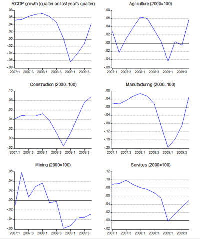
After three straight quarters of contraction, Malaysia’s 4Q09 GDP growth numbers confirmed that the country was out of recession, posting a growth of 4.5% against the same quarter last year:
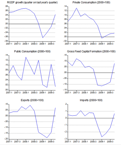
On the demand side, growth was driven by a strong recovery in trade and an 8.2% jump in domestic investment. On the supply side, growth was largely broad based and supported by fiscal stimulus measures which helped drive construction growth to 9.2%, while the manufacturing sector posted its first positive growth in four quarters. The only sector yet to recover is mining, albeit the fall in output improved to –2.8%:
Case 2:International standard
Malaysia’s 4Q09 GDP growth zoomed an impressive 14.2% despite a sharp pullback in government spending, which fell 11.1%:
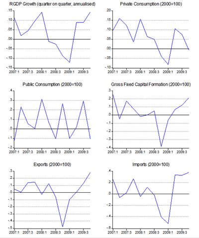
Output has now recovered to the level prior to the recession, which began in 2Q08 and lasted four consecutive quarters, to 1Q09. On the demand side, growth was driven by a 28.2% jump in exports and a 21.3% increase in domestic investment.
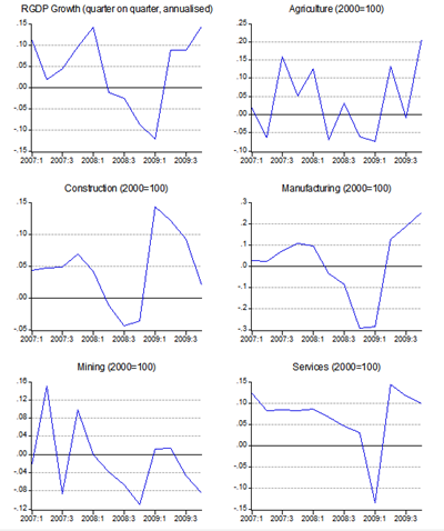
On the supply side, growth was uneven, with agriculture and manufacturing leading the way. Services growth was sustained, but mining sector output dropped 8.50% while construction output growth fell from 9.1% in 3Q to just 1.9% in 4Q2009.
Summary
A real study in contrasts isn’t it? While the broader picture is similar, the details show significant differences:
- The timing of the recession changes from beginning in 1Q2009 under the official standard to 2Q2008 under the international standard –a full three quarters earlier.
- The length of the recession also changes from 3 quarters to 4 quarters.
- Positive domestic demand growth in 4Q2009 turns negative under the international standard.
- The biggest differences are in the sector breakdowns, with sharp construction and services growth turning into consolidation, and first manufacturing recovery has actually been evident since 2Q2009.
If you recall, the first stimulus package was introduced in November 2008, which coincided with the GDP report for 3Q2008. At that point, under the international calculation the recession would have already entered its second quarter, but was still relatively shallow. The signs were already there however for the sharp drop in 4Q2008, and the even steeper drop in 1Q2009.
However, fiscal consolidation might have happened earlier with the emergence of the economy out of recession in 2Q2009 – that might not have affected for instance the credit support the government provided which formed the bulk of the 2nd stimulus package, but we might not have had as much of the direct spending that the government committed to (nor the pace of borrowing).
So…which way is better? From a pure macro-perspective, neither is necessarily good or bad. I don’t think there would be any changes in BNM’s policy moves for instance. But from a micro-perspective, the international standard offers a better picture of what’s happening on the ground and which areas need government support (if at all). Ideally, both methods should be reported and used for policy adjustments – as is the general practice elsewhere.
Technical Notes:
4Q2009 GDP report from the Department of Statistics
It’s The World Bank’s Turn
There’s already evidence that the IMF’s thinking on its approach towards assistance to developing countries has changed, retreating away from the cookie-cutter policies of the Washington Consensus.
Now we have World Bank mulling the same thing. In a new working paper (don’t believe the disclaimer about this not being World Bank thinking or policy), World Bank Chief Economist Justin Lin argues that the mechanisms and timing of structural change and industrial upgrading merit equal attention to technological diffusion. Again, nothing too controversial and just updating the structural school’s approach to development. Here’s the difference though (from the abstract, emphasis mine):
"As strategies for achieving sustainable growth in developing countries are re-examined in light of the financial crisis, it is critical to take into account structural change and its corollary, industrial upgrading. Economic literature has devoted a great deal of attention to the analysis of technological innovation, but not enough to these equally important issues. Te new structural economics outlined in this paper suggests a framework to complement previous approaches in the search for sustainable growth strategies. It takes the following into consideration:
First, an economy’s structure of factor endowments evolves from one stage of development to another. Therefore, the optimal industrial structure of a given economy will be different at different stages of development. Each industrial structure requires corresponding infrastructure (both “hard” and “soft”) to facilitate its operations and transactions.
Second, each stage of economic development is a point along the continuum from a low-income agrarian economy to a high-income industrialized economy, not a dichotomy of two economic development stages (“poor” versus “rich” or “developing” versus “industrialized”). Industrial upgrading and infrastructure improvement targets in developing countries should not necessarily draw from those that exist in high-income countries.
Third, at each given stage of development, the market is the basic mechanism for effective resource allocation. However, economic development as a dynamic process requires industrial upgrading and corresponding improvements in “hard” and “soft” infrastructure at each stage. Such upgrading entails large externalities to firms’ transaction costs and returns to capital investment. Thus, in addition to an effective market mechanism, the government should play an active role in facilitating industrial upgrading and infrastructure improvements."
Could it be that the World Bank is actually advocating industrial policy? If you’re not familiar with the debate, industrial policy (active government intervention in business and investment) used to be a very bad word in mainstream academic circles outside of a few radical thinkers. Heck, Malaysia has gotten enough criticisms on this issue, both inside and outside the country. Now the World Bank is saying, in effect, that it’s ok. Will wonders never cease?
Tuesday, February 23, 2010
The Clock Is Ticking…
Tomorrow’s GDP report will have some interesting repercussions. It won't only serve as confirmation that the economy has recovered (this post covers my thoughts on this), but also as a precursor to what the Governor refers to as “normalisation” of policy – which in BNM terms means the interest rate.
I don’t think we have to wait on tenterhooks for what the report will bring, as the PM has already let the cat out of the bag, and the Governor has been preparing the ground for an imminent rate hike for the past month.
On that basis, I’d expect a 25bp rate hike at next week’s monetary policy committee (MPC) meeting. More important however is the question as to what extent BNM will pursue “normalisation” this year. The last interest rate raising exercise began in 2005:11 and ended in 2006:4 spanning 5 MPC meetings, lifting the OPR from 2.70% to 3.50% (I got the details wrong in my previous post on this by the way). I don’t think we’ll see that level of aggressiveness this time, as the previous experience was largely a tightening exercise.
I’m still thinking in terms of a 75bp hike this year, with hikes probably every other MPC meeting – there are six meetings scheduled this year, with the next one coming on March 4th, then May 13th, 8th July, 2nd September and 12th November. So if there’s a hike next week, look for further hikes in July and November. All of this is predicated on a subdued outlook for inflation of course.
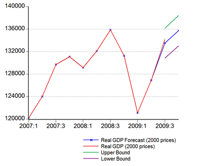
On another note, I did a quick and dirty forecast for 3Q 2009 GDP a few months back, based on the IPI. Using the same model (static one-step forecast), here’s the 4Q 2009 forecast:
Point Forecast:135720.14, Interval forecast: 138434.80-133005.48 ...which would be about 3.4% annual growth, or about 6.7% qoq annualised. However, from the hints dropped by the PM, I'm more inclined to think the actual would be closer to the upper bound of the forecast, which gives 5.5% annual growth and 15.7% quarterly. If you think that’s a wide range, it’s just par for the course with these types of simple models. We’ll see tomorrow evening.Dumb and Dumber: Cuepacs Edition
"Cuepacs is concerned about the 'increasing dominance' of female employees in the civil service, saying it would have 'long-term implications on the progress and growth of the country.'
Its secretary-general Ahmad Shah Mohd Zin said on Monday that the trend now was that more women officers were being appointed to important decision-making posts.
For example, almost three quarters of the new posts in the administrative and diplomatic service (PTD) were being filled by women, he said, adding that this was contrary to the present government policy to 'reserve only 30% of decision-making posts for women.'
(The actual government policy is to have women in at least 30% of decision-making posts. -- ED)"
Note the correction by the Star Editor on actual government policy. I'll let this chart from the DOS 3Q 2009 labour force survey to make my argument for me (click on the pic for the larger version):
I've made this point before - if we are ever to reach high income status, we need more women in the labour force, not less. The average labour force participation rate by women of working age in Malaysia is less than 50%, and just two-thirds of women aged 25-34 are in employment. Antediluvian patriarchal attitudes aren't going to get us anywhere.
More on the Minimum Wage
"As was the case in Ontario, recent evidence from the US illustrates the pointlessness of using the minimum wage as a way to reduce poverty (h/t Craig Newmark):
'Minimum Wages and Poverty: Will a $9.50 Federal Minimum Wage Really Help the Working Poor? Using data drawn from the March Current Population Survey, we find that state and federal minimum wage increases between 2003 and 2007 had no effect on state poverty rates. When we then simulate the effects of a proposed federal minimum wage increase from $7.25 to $9.50 per hour, we find that such an increase will be even more poorly targeted to the working poor than was the last federal increase from $5.15 to $7.25 per hour. Assuming no negative employment effects, only 11.3% of workers who will gain live in poor households, compared to 15.8% from the last increase. When we allow for negative employment effects, we find that the working poor face a disproportionate share of the job losses. Our results suggest that raising the federal minimum wage continues to be an inadequate way to help the working poor.'"
Read the comments on possible qualifiers to the general finding.
There's plenty of other empirical studies showing that the imposition of a minimum wage negatively impacts low-wage employment, which generally means two constituencies - the poor generally, and young men with inadequate labour skills. Here's a sampling (I think I've linked to some of these studies before):
- "Minimum Wages and Youth Employment in France and the United States", John M. Abowd, Francis Kramarz, Thomas Lemieux, David N. Margolis, NBER Working Paper 6111, 1997
- "Employment Effects of the Federal Minimum Wage", John F. Boschen, Herschel I. Grossman, NBER Working Paper 812, 1981
- "Raising Incomes by Mandating Higher Wages", David Neumark, NBER Reporter: Fall 2002
A quote from the last paper above which I find rather telling, especially in light of my last post (bold emphasis mine):
"Of course a finding that living wage laws reduce poverty does not necessarily imply that these laws increase economic welfare overall (or vice versa). Living wage laws, like all tax and transfer schemes, generally entail some inefficiencies that may reduce welfare relative to the most efficient such scheme. Finally, there is another reason to adopt a cautious view regarding living wages. As already noted, the effects of living wages appear only for broader living wage laws covering employers receiving business or financial assistance. The narrower contractor-only laws have no detectable effects. This raises a puzzle. Why, despite the anti-poverty rhetoric of living wage campaigns, do they often result in passage of narrow contractor-only laws that may cover a very small share of the workforce?
One hypothesis I explore is that municipal unions work to pass living wage laws as a form of rent-seeking. (25) Specifically, by forcing up the wage for contractor labor, living wage laws reduce (or eliminate) the incentive of cities to contract out work done by their members, and in so doing increase the bargaining power and raise the wages of municipal union workers. There is ample indirect evidence consistent with this, as municipal unions are strong supporters of living wage campaigns. As further evidence, I explored the impact of living wage laws on the wages of lower-wage unionized municipal workers (excluding teachers, police, and firefighters, who do not face competition from contractor labor). The results indicate that these workers' wages are indeed boosted by living wages. In contrast, living wages do not increase the wages other groups of workers whose wages-according to the rent-seeking hypothesis-should not be affected (such as other city workers, or teachers, police, and firefighters). Thus, even if living wage laws have some beneficial effects on the poor, this last evidence suggests that they may well be driven by motivations other than most effectively reducing urban poverty. While this does not imply that living wages cannot be an effective anti-poverty policy, it certainly suggests that they deserve closer scrutiny before strong conclusions are drawn regarding their effectiveness."
Ever wonder why its mainly unions that generally call for minimum wage laws? You have been warned.
Monday, February 22, 2010
Market Forces And The Minimum Wage
"The Malaysian economy's practice of letting open market forces decide on wages in this country is no longer practical, the Malaysian Airlines System Employees' Union (Maseu) said Monday.
Hence, Malaysia should have legislation on minimum wage to safeguard workers in the country, said Maseu executive secretary Mustafar Maarof.
He said, almost 100 percent of private sectors in the country practised the European and Western model of business.
"Most business consultants for companies in Malaysia are from these countries which have a minimum wage, for instance, United Kingom, United States, Australia, Switzerland, South Korea and Japan," he said in a statement here Monday.
He said, most business models in Malaysia were linked to these countries but the difference is that most of these countries had their own minimum wage and safety net for their workers, as compared to Malaysia."
I find this both funny and sad:
- Market forces will operate whether you have a minimum wage or not.
- If the minimum wage is above the market determined wage, then you get *gasp* unemployment, particularly at the margin (i.e. the poor).
- The reason why advanced economies have both a minimum wage and a social safety net is because the latter is necessary to compensate for the unemployment caused by the former.
- Direct transfers cause less distortion than a minimum wage.
- The only good argument for a minimum wage is to limit employer abuses - but that means keeping the minimum wage as close as administratively possible to the market determined wage. I support a minimum wage, but only for this particular reason.
- I find it ironic that a closed shop union is taking this stance, since while unions sustain members incomes through collective action, in aggregate they also induce unemployment by raising the cost of labour.
- Hence, if you're truly concerned about employment and income for people below the poverty line, than the last thing you want to discuss is the minimum wage.
Want An Independent Assessment Of The Malaysian Economy? Try The IMF
I stumbled across the IMF’s latest country report on Malaysia the other day while culling my email. Article IV consultations are conducted with all IMF member states on a regular basis – read this article on the background of IMF surveillance. A summary of the report is available here, if you don’t want to wade through the entire 60-page report.
Interesting reading even if its a bit dated, particularly in the differences in assessing policy between IMF and Malaysian authorities (Treasury and BNM). I’d particular point out pages 15-23, which covers future policy paths (liberalisation, private investment, reducing oil revenue dependency, abolishing subsidies, and fiscal consolidation), and a very interesting box article on page 21 which assesses BNM’s exchange rate intervention post-2005 (summary: it was two-sided, and not intended to force a particular exchange rate level).
Also of interest is a projection of the public sector debt path from pages 3-5 of the Informational Annexe (72% of GDP by 2014).
Not surprisingly, the biggest area of disagreement is on the level of the exchange rate. With the IMF’s three-prong statistical methodology, the Ringgit is considered undervalued though not extremely so, but the policy approach was “broadly appropriate”. Malaysia’s rebuttal is on pages 35-36, which is echoed by the IMF executive director for Malaysia’s statement at the end of the document (pgs 6-7). Here’s an interesting, and highly pertinent, quote from the latter:
“Secondly, while the current account surplus is sizeable, Malaysia is a commodity producer. Over two-thirds of the current account surplus can be attributed to commodities including oil. It is fundamentally inappropriate to apply the 3-model CGER estimations when an economy is a significant producer of non-renewable resources. A Fund working paper by Thomas, Kim and Aslam (2008) estimated that by applying an alternative methodology for assessing the external balance in countries with large stocks of non-renewable resources, the non-oil current account position for Malaysia was in fact in equilibrium, as oil resources can be expected to be depleted in the future. Our authorities would also welcome accelerated work on the commodity-based CGER approaches that we understand is being undertaken at the Fund. “
Technical Notes:
“Malaysia: 2009 Article IV Consultation - Staff Report; Public Information Notice on the Executive Board Discussion; and Statement by the Executive Director for Malaysia”, International Monetary Fund, August 2009
Friday, February 19, 2010
Fed Rate Hike? Not Yet
Update:
If you want to read a fascinating and highly informative discussion on the Fed’s exit strategy, particularly the use of interest on bank reserves, you can do worse than to read these two blog posts: here and here.
Death of the Washington Consensus?
The IMF last week issued a staff position report (warning: pdf link) that represents something of a mea culpa and a retreat from the Washington Consensus. Taken from the conclusion:
“The crisis was not triggered primarily by macroeconomic policy. But it has exposed flaws in the precrisis policy framework, forced policymakers to explore new policies during the crisis, and forces us to think about the architecture of postcrisis macroeconomic policy.
In many ways, the general policy framework should remain the same. The ultimate goals should be to achieve a stable output gap and stable inflation. But the crisis has made clear that policymakers have to watch many targets, including the composition of output, the behavior of asset prices, and the leverage of different agents. It has also made clear that they have potentially many more instruments at their disposal than they used before the crisis. The challenge is to learn how to use these instruments in the best way. The combination of traditional monetary policy and regulation tools, and the design of better automatic stabilizers for fiscal policy, are two promising routes. These need to be explored further.
Finally, the crisis has also reinforced lessons that we were always aware of, but with greater experience now internalize more strongly. Low public debt in good times creates room to act forcefully when needed. Good plumbing, in terms of prudential regulation, and transparent data in the monetary, financial, and fiscal areas are critical to our economic system functioning well. Capitalizing on the experience of the crisis, our job will be not only to come up with creative policy innovations, but also to help make the case with the public at large for the difficult but necessary adjustment and reforms that stem from those lessons.”
Nothing controversial about any of the above, but the devil is in the details. There are some pretty conventional prescriptions that the paper advocates – providing banking system liquidity as needed, fiscal prudence during good times, and strengthening automatic stabilisers aka transfers (tax-rebates, handouts) to the poor; but how about these bombshells:
- Should the Inflation Target Be Raised? - “Should policymakers therefore aim for a higher target inflation rate in normal times, in order to increase the room for monetary policy to react to such shocks? To be concrete, are the net costs of inflation much higher at, say, 4 percent than at 2 percent, the current target range? Is it more difficult to anchor expectations at 4 percent than at 2 percent?”
- Combining Monetary and Regulatory Policy - “If leverage appears excessive, regulatory capital ratios can be increased; if liquidity appears too low, regulatory liquidity ratios can be introduced and, if needed, increased; to dampen housing prices, loan-to-value ratios can be decreased; to limit stock price increases, margin requirements can be increased.”
- Inflation Targeting and Foreign Exchange Intervention - “Central banks in small open economies should openly recognize that exchange rate stability is part of their objective function. This does not imply that inflation targeting should be abandoned. Indeed, at least in the short term, imperfect capital mobility endows central banks with a second instrument in the form of reserve accumulation and sterilized intervention. This tool can help control the external target while domestic objectives are left to the policy rate.”
Gosh.
In case you’re not clear about what they’re talking about, in plain English the IMF are calling for:
- A higher average inflation rate target and by extension, a higher than average policy interest rate as well. The basic goal of central banks worldwide in the last thirty or so years has been price stability, which in real-world terms (taking into account structural issues and a buffer for real money supply growth) has translated into an average inflation goal of around 2%. Higher inflation would have distortive effects on business and personal decisions, such as on investment and savings.
- Capital controls and market intervention. Can I say, we told you so?
- Exchange rate intervention. Can I say…oh, I said that already.
In short, this is a retreat from the free market fundamentalism that has characterised IMF and World Bank policy approaches for decades. What a comedown. There’s also the unspoken acknowledgement here that every country is different, and that the one-size-fits-all approach (or in business-school-speak – using “best practices”) to remedial policies is suboptimal, er, won’t work.
I’m not knocking the basic conclusion that free markets are the best method of organising economic activity. But I do think we have to be pragmatic and recognise that real-world markets everywhere are distorted by asymmetric information and differing levels of pricing power between buyers and sellers. It should also be recognised that while the price discovery process through the interaction of supply and demand is the best way to obtain a Pareto-optimal allocation, nothing says that any given equilibrium point is “first-best”.
Technical notes:
- “Rethinking Macroeconomic Policy”, Blancard, O. and Giovanni Dell’Ariccia and Paolo Mauro, IMF Staff Position Note, SPN/10/03, International Monetary Fund
- INTERVIEW WITH OLIVIER BLANCHARD, “IMF Explores Contours of Future Macroeconomic Policy”, IMF Survey Magazine
Thursday, February 18, 2010
Panels and Pools: Malaysia's Demographics Part IV Continued
Model III
In the last two attempts to make use of empirical evidence to suss out the relationship between the median age and dependency ratios of the population and income, we’ve looked at essentially two dimensional representations – Malaysian data across time, and a large sampling of countries at one point in time.
This post looks at a three-dimensional approach, of a large sample of countries across time (sorry, no graphs here). This is generally known as a panel or pooled approach, so if you ever come across the term, you’ll know what it means. Two further terms you need to know are “balanced” and “unbalanced”, which refers to data that is symmetrical (all countries have data for the sample period in question) or not.
Bear in mind that this is my first stab at working with panel data, so if you have any advice/contribution/criticisms to make, sound off in the comments – I want to hear from you!
I’ll skip all the technical stuff and go straight to the results (read the accompanying notes if you’re interested in the details):
- LOG(GDP_MYS) = 0.87 + 3.90*LOG(AGE_MYS) - 4.04
- LOG(GDP_MYS) = 0.66 - 2.11*LOG(RATIO_T_MYS) + 7.47
- LOG(GDP_MYS) = 1.16 + 1.76*LOG(RATIO_O_MYS) + 12.66
- LOG(GDP_MYS) = 0.89 - 1.83*LOG(RATIO_Y_MYS) + 7.17
- LOG(GDP_MYS) = 0.87 + 3.93*LOG(AGE_MYS) + 0.02*LOG(RATIO_T_MYS) - 4.12
- LOG(GDP_MYS) = 1.00 - 0.96*LOG(RATIO_Y_MYS) + 0.49*LOG(RATIO_O_MYS) + 1.69*LOG(AGE_MYS) + 3.54
I’ve only reported here the results for Malaysia; all the coefficients and regressions as a whole are statistically significant. As you can see (if you haven't gotten cross-eyed!), we again have general confirmation of the stylized facts:
- A higher median age is associated with higher incomes
- A lower dependency ratio is associated with higher incomes
- A lower youth dependency ratio is associated with higher income
- A higher old age dependency ratio is associated with higher income
The regressions that combine age with dependency ratios are less clear (just like in my first two attempts), with the possible interpretation that age has a bigger impact than any of the ratios. Unfortunately like in Model II, I'm still not getting plausible estimates for income - or I've screwed up somewhere. If I can figure it out, I'll revisit this topic in a future post.
It turns out that only the first, simplistic model (Malaysian data across time) comes close to providing reasonable estimates of income levels into the future. This suggests that the country specific factors driving Malaysian income are strong enough to overcome some of the disadvantages we face because of our demographic structure.
I have to reiterate this - Malaysia is a middle income country with a population structure of a low income country. I suspect that being an oil producer is one big leg up over that particular hurdle, although I haven't been able to statistically prove this - using a dummy for oil production across the whole sample didn't yield statistically significant coefficients. Other potential boosters that have generally been put forward in the literature include the ability to produce sufficient food (arable land) and institutional factors that have been the basis for inward investment.
Whatever the causes may be, we're ahead of the game in some respects and have the potential to sustain above-average growth going well beyond that of our regional peers - Malaysia's labour force as a proportion of the population will keep on rising for decades to come.
Technical Notes
- GDP data from the IMF World Economic Outlook Database (April 2009)
- Population estimates from the US Census Bureau International Data Base
- Sample size is 179 countries, with age, ratio and gdp data from 1991 to 2008 (unweighted, unbalanced panel; 3097 observations)
- GDP data is in current international dollars
- Fixed effect dummies are used to model individual country variations (second intercept term in the equations above) - no time effects (fixed or random) are assumed
Sunday, February 14, 2010
The Adventures of Scattershot Billy: Malaysia's Demographics Part III Continued
Model II
This second attempt at finding a relationship between population characteristics and income uses a both a broader and narrower approach than that in the first post in the series. Rather than taking one country and tracking the data over time, a cross-sectional approach uses more countries (to ensure more universal applicability) but at only one point in time.
I've culled and cross referenced the IMF's World Economic Outlook database (for income) and the US Census Bureau's International Data Base to see if a relationship exists between my two population structure variables of choice (median age and dependency ratio) and income (in this case, GDP per capita in international dollars). I have a sample size of 181 countries with the data I'm looking for, out of the approximately 210 available from both databases - all data is from 2007, as 2008 data for some countries still consists of estimates.
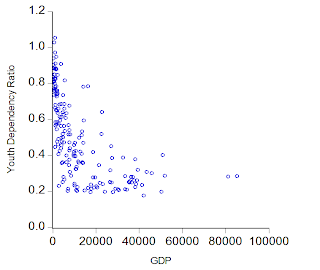
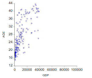
The best way to show the relationship between the data is through scatter diagrams, with each data point representing an individual country:
Some observations:
- It's clear that a low population median age is associated with low income, but the opposite cannot be said to hold - a high population median age does not guarantee a high income economy. This is partly due to the effect of some countries in the sample which have generally done badly, or are only just starting to take off after policy/strategy mistakes, e.g. the ex-Soviet bloc countries, which had relatively mature stable populations but had not benefited from following a market system until recently. However, this also means that any regression attempt must be qualified by a relatively large confidence range.
- The dependency ratios substantiate the stylized facts - "young" countries tend to have lower incomes, while "older" countries tend to have higher incomes. But as with the median age, the experience between countries varies widely, depending on their particular circumstances. It's interesting to note that there's a "floor" to the youth ratio and a "ceiling" for the old age ratio, beyond which countries rarely cross.
Running the regressions (based on the trimmed sample), we get:
- LOG(GDP_TRIM) = 3.40*LOG(AGE_TRIM) - 2.36
- LOG(GDP_TRIM) = -3.32*LOG(RATIO_T_TRIM) + 6.92
- LOG(GDP_TRIM) = -2.03*LOG(RATIO_Y_TRIM) + 7.05
- LOG(GDP_TRIM) = 1.35*LOG(RATIO_O_TRIM) + 11.84
- LOG(GDP_TRIM) = 2.73*LOG(AGE_TRIM) - 0.81*LOG(RATIO_T_TRIM) - 0.61
...which gives the same interpretation that we found in the single country example in the first post in this series i.e. higher median age and a higher old age dependency ratio are associated with higher income, while the opposite relationship exists for the total dependency and youth dependency ratios. Comparing the two sets of estimates, the biggest differences in the coefficients are with median age (3.40 here against 6.86) and to a lesser extent, with the old age dependency ratio (1.35 against 2.80).
The best two fits are with regression 1 and regression 4, but having said that, none of these regressions yield future income estimates that make plausible sense. So while this approach has yielded some nice visual representations, it's a failure as a conduit for forecasting Malaysia's future income.
From a certain perspective that's understandable - this approach would best describe the "global population", and ignore any country specific differences that may influence income. Given that Malaysia is a little unusual in having a "younger"-than-normal population for its income level, we're not likely to get usable forecasts. On the other hand, we should at least allow for this more "global" experience to influence any other forecasts we make, as there is alwasy the possibility that Malaysia in future would "revert" back to the mean of the global experience.
That leads to the last approach, where we combine time series (from the first post) with cross-section data (this post). Coming up next.
Technical Notes
- GDP data from the IMF World Economic Outlook Database (April 2009)
- Population estimates from the US Census Bureau International Data Base
Happy Chinese New Year!
Thursday, February 11, 2010
Income, Age and Dependencies: Malaysia's Demographics Part II
To wit: Is there a long term causal relationship between the age profile of a country, and it's potential to generate income? That's a hard (and complicated) question to answer, so in the best traditions of economics, I'm going to grossly simplify: Is there a statistical relationship between either the median age of a population or its dependency ratio, with GDP per capita?
Changing the question completely avoids the problems attempting to model the distribution of age within a population by focusing on simple numeric measures of a population structure, with the obvious pitfall of getting it all wrong if those measures are not actually related to income. Note that I'm also completely avoiding the issue of causality.
My underlying hypothesis here is that the higher the median age the greater the potential for generating income while the dependency ratio should have the opposite effect; and I'm also assuming that the relationship is linear. In real life, because of the different impact of the old age cohorts (high savings and consumption) compared to children (must be fully supported by the working population), I suspect the relationship between income with age and dependency would in actuality be non-linear, but particularly for the dependency ratio. If you recall the discussion in the last post, at the 1st and 4th stages of the demographic transition, the population is stable, which means there won't be a demographic impact on incomes at those stages. However, there are very few countries (Japan comes to mind), who have high enough median age populations to test this, so I'm pretty sure I'm safe assuming linearity in stages 2 and 3.
Moving on to the question of methodology, there's a number of approaches to answer the income-age/income-dependency question:
- The single country approach - simplest and least demanding to do, using time series data from a single country only;
- The cross-sectional approach - combines the data from a number of countries from a single year which is a more universal application, but ignores the probability that the sought-for relationship may actually change across time, as well as ignoring country-specific effects (government policies, availability of arable land etc);
- The pooled/panel approach - combines both cross-sectional and time series data. Great if you can manage it, but has horrendous data requirements depending on how many countries are included in the sample (preferably all).
I'm going to cover all three approaches (hey, I'm ambitious), and hopefully we'll come up with an answer that makes sense, as well as provide some forecasts as to if and when Malaysia may reach high-income status. Since the material is pretty extensive, I'm going to split this into three quick posts, rather than just the one I had originally planned, to make reading a little easier.
Model I
Here's the dataset I'm working with (details at the end of the post):
Note the different trends of the youth and old age dependency ratios (both relatively trend-stationary), which result in a non-stationary total dependency ratio. Also, I have high correlations between most of the variables, so there is the potential for multicollinearity problems (which tested out as being confirmed between median age and the old age ratio):
| GDP_MYS | AGE_MYS | RATIO_T_MYS | RATIO_O_MYS | RATIO_Y_MYS | |
| GDP_MYS | 1.00 | 0.98 | -0.95 | 0.98 | -0.96 |
| AGE_MYS | 0.98 | 1.00 | -0.74 | 0.99 | -0.97 |
| RATIO_T_MYS | -0.95 | -0.74 | 1.00 | -0.63 | 0.88 |
| RATIO_O_MYS | 0.98 | 0.99 | -0.63 | 1.00 | -0.92 |
| RATIO_Y_MYS | -0.96 | -0.97 | 0.88 | -0.92 | 1.00 |
Next, I ran a series of regressions - GDP against all the variables, singly or in combination. Here are the results:
- LOG(GDP_MYS) = 6.86*LOG(AGE_MYS) - 12.42 + [AR(1)=0.47]
- LOG(GDP_MYS) = -3.60*LOG(RATIO_T_MYS) + 7.55 + [AR(1)=0.72]
- LOG(GDP_MYS) = -2.88*LOG(RATIO_Y_MYS) + 7.54 + [AR(1)=0.71]
- LOG(GDP_MYS) = 2.80*LOG(RATIO_O_MYS) + 16.65 + [AR(1)=0.71]
- LOG(GDP_MYS) = 10.78*LOG(AGE_MYS) + 2.53*LOG(RATIO_T_MYS) - 23.62
- LOG(GDP_MYS) = 8.74*LOG(AGE_MYS) + 3.28*LOG(RATIO_Y_MYS) + 2.14*LOG(RATIO_O_MYS) - 10.77
All coefficients are statistically significant at the 5% level, with the regressions showing very high r-squared figures, and diagnostics that (mainly) work out ok. The AR(1) terms, where present, are to correct for serial correlation.
I know this is terribly wonkish, and not at all easy to follow if you've never studied statistics, but bear with me. To read the equations, simply treat the numbers before each variable on the right hand side as the precentage change to GDP per capita, from every percentage change in that particular variable. So from equation 1, a +1% rise in the median age results in GDP per capita rising +6.86%. If the number is negative, then the relationship between that variable and GDP is also negative.
More generally, the results tend to bear out my intuition:
- An increase in the median age is associated with an increase in GDP per capita
- A reduction in the total dependency ratio (both youth and old age cohorts) is associated with an increase in GDP per capita
- A reduction in the youth dependency ratio is associated with an increase in GDP per capita
- An increase in the old age dependency ratio is associated with an increase in GDP per capita
- The last two results show the wrong signs for the dependency ratio coefficients, which is an artifact of the mutlicollinearity problem
The forecasts generated by the regressions are summarised in the chart below:
...which is an awfully wide range of estimates. Model selection criteria points squarely at equation 6, which just so happens to generate the highest forecast GDP per capita - tripling GDP per capita from 2010 to 2020. That doesn't seem plausible - although I should point out I'm forecasting 40 years forward from just 18 years of realised data.
Of the single variable regressions, the next best is equation 4 (GDP with the old age ratio), followed by equation 1 (GDP with median age). Both have GDP per capita doubling by 2020, although the forecasts diverge substantially after that.
Will that be enough for Malaysia to achieve high-income status? It will be close. The standard by which income is judged is the World Bank's classification, which converts local currency nominal GNI per capita to USD using the Atlas method. As of 2008, Malaysia's GNI per capita is around USD6,970, about 41.5% below the high-income threshold of USD11,906. Assuming 3% inflation per annum, that means by 2020 we have to hit GNI per capita of about USD16,975. In PPP-corrected terms (assuming price levels increase by the same ratio), that's about 34,270 in current international dollars, or ever so slightly above the 2020 forecast of equation 4 (34,187) and not too far from equation 1 (31,231).
In other words, it will be a close run thing. Given the uncertainty built into the forecasts and my assumptions, we could potentially pass the high-income barrier before 2020, and equally we might pass it well after. It really depends.
On the other hand, it also seems pretty clear that Malaysia's demographic transition will play a role in accelerating the process.
Technical Notes:
1. GDP data from the IMF World Economic Outlook Database (April 2009)
2. Population estimates from the US Census Bureau International Data Base
Dec 2009 Industrial Production: Wow! Er, Not Quite
Tuesday, February 9, 2010
It's The People, Stupid! Malaysia's Demographics Part I
Here's a few predictions about the future of Malaysia:
1. By 2020, the level of crime will have increased about 13%-14%, irrespective of the policies of the government (whichever one we will happen to have by then), or the level of enforcement.
2. Property and housing will be a very good long term investment.
3. We will still be considered a middle income country, but only just.
There's a common thread underlying these predictions - demographics. I got prompted to look at this from a few paragraphs in the introduction to Freakonomics (crime in the US fell in the mid-1990s because of the impact of Roe vs Wade on legalised abortion two decades earlier), as well as rereading this fascinating old article from the IMF's Finance and Development magazine. It's a stylized fact that a bigger working population relative to the population as a whole is associated with (I won't say "causes") higher per capita incomes.
A dynamic view of this relationship can be explained by the demographic transition model (the Wikipedia article on this is pretty good - no, I haven't read any primary sources on this yet):
Stage 1: preindustrial society; population stable
Stage 2: better health care causes death rates to drop and improves infant survival; population growth
Stage 3: urbanisation, increasing incomes, and other factors cause the fertility rate to drop; population growth slows
Stage 4: industrial society; population again stable, but at a higher level
Stage 5: countries where the birth rate drops to low; population shrinks
There is therefore the potential for what's called the "demographic dividend", a transitory phase where a larger working population coupled with lower fertility rates means excess income that can be used for investment and asset accumulation. The IMF article further argues that there is a second dividend arising from a larger, wealthier old-age cohort who invest their retirement funds, thus further boosting the pool of funds available for investment.
In short, countries in stage 3 and stage 4 tend to have higher growth and then higher incomes, relative to those in earlier stages. The IMF article estimates that as much as 44% (about 1.9% p.a.) of South-East Asia's growth between 1970-2000 came from this transition. This article makes an even more comprehensive argument that demographic change was behind the East Asia growth "miracle".
To illustrate, here's Thailand's population pyramids between 1965 and 2050 (from the IMF article):
So what's the point of all this?
Malaysia is actually the diamond in the rough (or if you prefer, the thorn among the roses). When other countries in the region began actively trying to restrict population growth after the 1960s, Malaysia only paid lip service to the idea then went the other direction with the 1984-85 National Population Policy. If you aren't old enough to remember this, the goal was to increase the population to 70 million by 2100 - with lots of accompanying jokes about encouraging polygamy, natch.
As a result, we are far behind the curve in getting into stage 3 of the demographic transition compared to our regional peers. To compare, here are the population pyramids for Singapore, Hong Kong, Korea, Taiwan, Thailand, Indonesia and Malaysia in 1990:
...and the same countries in 2010:
(All the above from Nationmaster.com: you can find more population pyramids on the site, look under age distribution under each country page).
Note the substantial difference in age structure between the Asian Tigers and the other three countries shown here. Also, Malaysia appears to be behind even Indonesia in starting the stage 3 demographic transition.
Two other ways of looking at the same data is to use the median age of the population, and the dependency ratio, which is defined as the percentage of the population outside the 15-64 age bracket (using the same sample of countries):
Malaysia will have the same population median age in 2050, that Singapore had in 2000! This explains a lot of why Malaysia has lagged the Asian Tigers in growth - imagine a 2% disadvantage in per capita income growth every year, for a whole generation. On that basis, it's actually more surprising we are a middle-income country at all, as our population age profile is more typical of a stage 2 low-income economy.
The implication is also that Malaysia's growth potential over the next couple of decades is far higher than most of the region - apart from Indonesia, the rest of the economies in this (unscientific) sample will be subject to rapid population aging after about 2015. But the key to realizing that growth potential of course is putting in place the correct policies to take advantage of the demographic dividend when it comes.
Getting back to the predictions I made at the top of this post, the reasons why should be clear:
1. The level of crime will increase 13%-14%, simply because the supply of potential criminals will increase by the same portion (I'm assuming males in the 15-29 age bracket). The confidence interval for this would necessarily be large, as the other determinant of crime is the state of economy (and believe it or not, not enforcement).
2. Population growth in the working-age cohorts will increase demand for relatively scarce housing and residential land.
3. Based on some models I'm working with and the assumptions I'm making, I'm getting estimates of between 2023-2030 (when the median age will be between 28-30) when Malaysia will pass the middle-income barrier. That's when the current crop of youngsters will have entered the workforce and started earning and consuming (assuming of course, we manage to generate enough jobs and entrepreneurial opportunities for them).
Technical Notes:
1. Demographic Transition, Wikipedia article
2. Demographic Dividend, Wikipedia article
3. "What is the Demographic Dividend", Lee, Ronald & Andrew Mason, Finance & Development Magazine, Sept 2006 Vol43 No3, International Monetary Fund
4. "Demographic Dividend", Barker, JF, Online article, Population Growth & Migration website (2004)
5. Population pyramids from Nationmaster.com
6. Global population data and estimates from the US Census Bureau's International Data Base
Sunday, February 7, 2010
The Middle Income Trap
His proposals:
- Phase out price controls and subsidies
- Institute a high wage policy
- Innovative incentives for high tech activities
- IT infrastructure and public R&D centres
- Leverage on Malaysian professionals and experts overseas
- Emphasize our strategic location
- Promote green energy
- Promote medical care and pharmaceutical trials
- Go downstream in oil & gas
Mostly policies I would agree with, and much what I would expect from the government in due course. I do have a couple of criticisms of his analysis though, of the use in the article of comparing Malaysia against the UK, Singapore, and Hong Kong.
First the wage comparisons are of policemen, teachers, accountants and clerks across the four countries. Note that these are all service occupations i.e. in the non-tradable sector. A comparison here would only be valid if all four countries had a single labour market, where demand and supply would equate the level of remuneration. Since they're not, wages will not necessarily be equalized even assuming the same development policies were pursued. Dr Fong relates that foreign multinationals are willing to leave if foreign (i.e. low wage) workers were restricted from working in Malaysia - this is in the tradable sector, where the labour market is more exposed to international competition. He misses the distinction between the two sectors, as well as the policy implications.
My second critique is one of omission. I think there's a simpler explanation of why Malaysia is in a middle income trap, while the rest of our regional peers have progressed more rapidly. There's a fundamental factor that many commentators appear to have missed in discussing Malaysia's middle income conundrum, and that's the demographic profile of the country.
Here's the median age and dependency ratios of Malaysia against the Asian tigers (all figures are 2009 estimates):
| Malaysia | Singapore | South Korea | Hong Kong | Taiwan | |
| Median Age | 24.9 | 39.0 | 37.3 | 42.3 | 36.5 |
| Dependency Ratio | 57.2% | 30.4% | 38.2% | 34.0% | 37.7% |
Do you think maybe, just maybe, that our population characteristics might have something to do with this? Stay tuned, I'll have much, much more to say on this subject.
Technical Notes
1. Caught in middle-income trap By Dr FONG CHAN ONN; The Star Online February 7, 2010.
2. Population data estimates from the US Census Bureau's International Database.
Saturday, February 6, 2010
Dec 2009 Trade: A Nice Surprise
The December trade data is a case in point. Just as I was questioning my own view that we may be seeing a sustained rebound in trade (due to the lackluster November data), the next month sees a pretty spectacular rebound, at least by some measures:
That's the best performance in terms of annual growth since the middle of 2008, although the month-on-month view is less bullish. In terms of levels, both exports and imports are approximately back at the same levels as in 2007, which is encouraging not just locally but for the outlook for global trade generally. The unadjusted data fell approximately in the middle of the upper range of my December forecast, but seasonally adjusted data very nearly busted the upper bound of the range forecast (i.e. a probability of around only 5%). Them's pretty good numbers.
What's interesting is that this surge is not being driven by exports from the E&E sector, where exports are still around 2004 levels (RM millions):
Just to underscore the decline of E&E as Malaysia's primary export earner, the percentage share of E&E exports to total exports has fallen steadily since about 2001:
This isn't necessarily a bad thing - reliance on one sector enhances external vulnerability, and a more diversified export base would (hopefully) strengthen the economy against external shocks.
Next month's forecasts:
Point forecast:RM52,017.89m, Range forecast:RM58,505.89m-RM45,529.89
Seasonal difference model
Point forecast:RM48,148.60m, Range forecast:RM54,927.70m-RM41,369.51m
Technical Notes:
Trade data from Matrade.
Tuesday, February 2, 2010
"Normal" Interest Rates?
Madam Governor's comments here, and research houses reactions here.
What's "normal"? It's difficult to say, since the use of the Official Policy Rate (OPR) as the policy instrument is relatively new in historic terms. In the 1980s, BNM experimented with money base targeting (as was the fashion at the time). When that failed, it became a combination of exchange rate and interest rate targeting to manage changes in the price level and output. The reason for this was that Malaysian interest rates were not really market determined until the mid-1990s, although the exchange rate target was retained until the 1997 crisis. After that of course, we had the peg with the USD, which allowed for a transition to pure interest rate targeting, which is what we have now.
So really in examining BNM's history with interest rate targets, we're really looking at the last ten years, and very specifically the last five i.e. since the Ringgit was floated in July 2005. That's not a whole lot of history to look at in terms of determining what BNM considers "normal" as we're not even through a single business cycle during that time span. Looking at the short term interbank rates (which is what the OPR is designed to influence) isn't very illuminating:
The last time the OPR was raised, it took nearly a year to move up 1%, so the expectations of a gradual 50bp-75bp move up this year looks about right, which would take the OPR to 2.75%. Whether BNM will go the whole hog and match the 3.50% last seen in 2006-2008 is a another matter, and would depend on the path of the economy.
My guess is that economic activity will be much stronger than expected this year, and the first 25bp hike may very well come in the next Monetary Policy Meeting this March, as the results from 4Q2009 GDP will already in the books by the end of this month, and there will be two months worth of industrial output and trade available to gauge economic strength this year. Mind you, Chinese New Year will put a dent in February's output, so that may be a consideration as well.
A more satisfyingly statistical approach would be to try and determine if BNM is following some form of Taylor Rule; but as I said earlier, we don't have a lot of data to work from (10 years - about 40 quarters; with two different sets of exchange rate policies to factor in; and one tightening cycle and one loosening cycle; is definitely not enough).
