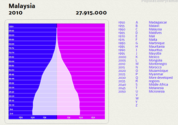
This site is gorgeous – you can actually see how the age profile of a population evolves over time.
To use, click on the alphabet to expand the country list, then click on the country and a date. The site generates the population tree automatically (works with non-Flash browsers, too) – successive clicking on dates causes the population tree image to transition smoothly (click on link for bigger pic):
What struck me immediately about the Malaysian data was the sudden influx of toddlers in 1985 compared to 1980 – the National Family Policy came into being in 1985, so that shouldn’t have had an impact. But it seems to me that Malaysia was on the cusp of going into Stage III of the demographic transition model, then suddenly reversed course.
An unexplained mystery to me – I was in secondary school at the time, so memory of policy moves and the socio-economic environment at that time are a bit hazy. Anyone care to contribute?
(H/T: Blog About Stats)


I made this site, and I am very happy that people seems to like it ! Thanks for blogging about it.
ReplyDeleteHi Martin, you did great work, happy to oblige!
ReplyDelete